Showing posts with label color. Show all posts

Wednesday, March 13, 2013

petri dish art


These beautiful paintings are the work of Klari Reis. Instead of using traditional canvas as the foundation for her art, she uses petri dishes. The results are visually stunning. The title of each piece is pretty terrific too. Check out the complete gallery here: The Daily Dish 2013. A new one is posted each day. This is her second go 'round, and while those are impressive, I find her latest batch more striking. Read more about the project on her site.


color of the year


Well, I'm a little behind on posting this, and it almost doesn't seem worth the trouble BUT it's become a tradition of sorts. I'm never one to break [ pointless ] routine so I give you my 6th post on Pantone's Color of the Year. They did their usual bang-up job making a pigment on a palette sound like the elixir of life. 

"Lively. Radiant. Lush… A color of elegance and beauty that enhances our sense of well-being, balance and harmony."

This is in fact one of my favorite colors. Rather than create a collection of beautiful emerald objects, I'm going to go the lazy route and offer some links to Pinterest eye candy.

SET ASIDE A DAY OR TWO AND GO:
TONS of boards -- [ Pantone Color of the Year 2013 ]
Not necessarily Pantone themed, but one of the boards I follow -- [ Going Green / Nathalie Chicha ]


Wednesday, February 15, 2012

color test


I thought this was a fun little challenge. There are various levels where you have to select the correct corresponding shade(s). Sometimes it's a bit harder than it looks. Other times it's an easy victory, and those are always nice. Give it a shot yourself here

Friday, February 3, 2012

color of the year


I don't know how I almost forgot about posting this -- after all, it's been a tradition since 2008. For those of you that care about the Pantone color of the Year, this is probably old news. For those that don't, well you're probably not even reading this. But here I go anyway.

So this is it -- Tangerine Tango. I'm a bit iffy on orange. Maybe it's the sea of Longhorns around me, or maybe it feels too Halloweeny outside of the holiday. However, contrary to many blogs out there that have assembled collections of orange things you should love, there are in fact shades of orange. I know, shocking. Someone might want to pass the word around. That said, and in spite of living in U.T. country, I think I like tihs version of orange. Could be because, and I quote Pantone, it's "exotic, but in a very friendly, non-threatening way". That IS what I look for in a good color. 2012 is gonna be good.

Friday, January 27, 2012

mold-a-mania


When I was a kid I desperately wanted one of those animals you could get out of a machine for $.50 at the zoo. I never got one, and clearly never got over it, even after ordering a set on-line a few years ago. Mold-a-rama machines gifted kids with an array of plastic figurines during the last several decades of the 20th century. They're not sophisticated toys by any stretch but they're bright and they're fun (and if you got one from a machine you saw them come to life). I stumbled upon Mold-a-Mania's site and discovered a really amazing collection that I'm currently coveting. Also be sure to check out the companion Flickr profile if you need to bookmark some favorites. And I might be crazy but I think some of these images would make great prints -- I'd buy them.

Tuesday, November 15, 2011

good medicine: the incredible shrinking woman


I feel like lately I've been writing a lot about my childhood obsessions. Well here's one more. When I was a kid I LOVED the 1982 movie The Incredible Shrinking Woman -- a zany tale, staring Lily Tomlin, about the perils of consumerism (or how Galaxy Glue will make you shrink). Over the years I've searched high and low for a DVD copy. Recently I was thrilled to find it on instant streaming on Netflix. I can't say that it's completely held up over time, but it's still a fun film with a kooky color palette; the cast appears to be dipped in an array of candy coated brights and pastels. One favorite is the mint green suit that Charles Grodin wears.

I almost wonder if Tim Burton was semi-inspired by the set design and costumes. Look through some of these screen shots and ask yourself if there's not a similarity to Edward Scissorhands.


More after the jump...

good medicine: seinfeld in color

Yes! I want more!

Wednesday, October 26, 2011

good medicine: matt rich


Another splash of color for the day. Happy eyes equals happy brain. These paintings by Matt Rich are just what the doctor ordered.

good medicine: cubicle refugee


Oh how I love some categorized color. For some reason I've been needing a good dose of green too; I've had a hankering to visit a lush forrest in a far away mountain terrain. Until a plane ticket magically lands in my lap this site will be my back-up, for that and every other color from a rainbow.

Follow the link to check out Cubicle Refugee.

Friday, May 27, 2011

Tim Fishlock - Shapeset


More shapes. More possibilities. Cool type by Tim Fishlock. Even cooler name.

Friday, January 21, 2011

daily hues


Daily Hues is a unique and clever project by Anne Ulku in which outfits she wears each day are translated into a variety of shapes and colors. In her words:

DailyHues™ is a way to document the colors that I wear on a day-to-day basis in the means of an infographic. Size of the color depends on the proportion it yields to the piece of clothing. Each version of info graphic design composition and shapes goes on for 30 days.

carl kleiner


If you spend any time checking out art/design blogs odds are that you have seen Carl Kleiner's work for Ikea's cookbook “Hembakat är Bäst” (Homemade is Best). I hadn't really checked out the rest of his site until recently though, and that is when I fell for the "Skanska" series. Is it paper? Is it not? I have no idea, but I enjoy that it at least looks like it is, along with the colors and simplicity. A few more images are after the jump.

Wednesday, January 19, 2011

future reading


I really love this image by Kevin Van Aelst. It accompanies a recent article in the New York Times about Vook discussing the general way we are changing how we read and what place visuals have in the digital age of literature. 

Monday, December 20, 2010

color of the year


I was never much of a pink girl, at least not growing up. Lately I have come around though. Well I don't wear it and as a home decor color choice (aside from my favorite lamp) not so much. In the right dose and in the right circumstances it can actually be quite attractive and dare I say even bring a smile to my face. I think I will have to agree with Pantone, there is nothing "everyday" about it, unless of course you are a five year old girl or a plastic doll.

Courageous. Confident. Vital. A brave new color, for a brave new world. Let the bold spirit of Honeysuckle infuse you, lift you and carry you through the year. It’s a color for every day – with nothing “everyday” about it.

Tuesday, September 28, 2010

santiago salvador


"Holy cow, I'll take everything", is what comes to mind when I look at Santiago Salvador's work. What comes to your mind is that I take Centrum Silver. No, only my exclamations are only old. Then what comes to your mind is, "yes, I'll have it all too". Then your mind blows up because this series is that awesome.


CHECK OUT HIS:
Flickr

Wednesday, June 16, 2010

project 33


I'm catching up with the rest of the blogging world and finally posting something about the site Project 33. As a die-hard lover of colorful shapes (why does that sound weird?) and vintage illustrations I have just fallen for this slice of heaven. There are lots of album covers to peruse. You can even search by shape! Yes, I like this. You can tell by the exclamation mark. Also be sure to check out sister site Groove is in the Art for more psychedelic entries.


[ via Words & Eggs ]

Wednesday, March 3, 2010

color wheel


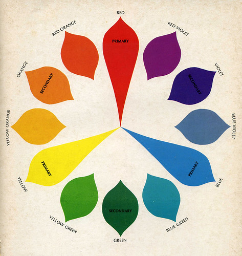
My friend Seana got a booklet called "Room Service: How to Re-do and Re-new Your Home Using Fabrics with Celanese Contemporary Fibers" (wooooo, that's a mouthful) from our pal Jessica. I love this color wheel image. That is all.

Friday, February 26, 2010

what devo color are you?


Want to take a quick cyber walk on the weird side? Check out Club Devo. I'm a fan of anything that incorporates color/word/sound associations, and in such a fun, ridiculous way. After 17 questions I found out I am blue. And I guess I really don't like orange cars... or men with orange cars.

Thanks for Shaun (@f_letter)for the Twitter tip!

Thursday, February 25, 2010

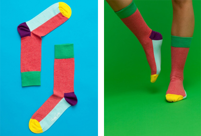
happy socks = happy feet


I rarely go without socks... I have a naked feet issue, maybe because they are almost always cold. In fact I envy those carefree souls (soles?... ugh, I know), especially in the summertime, and I'm the weird one swimming with socks. Ok, I'm not that bad. But I do love my socks and gravitate towards styles that children would most likely love too. My tastes are that nauseatingly cute and now that my dog Boo has eaten most of my "good" socks I may need to get a few pairs of these from Happy Socks.

[ Link via The Post Family ]

Wednesday, February 24, 2010

do you like seeing green?


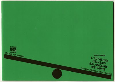
I have mentioned before my love of the site Words & Eggs, but Lesley keeps busy with another project (one of many)... My Green Screen. Here there is a wonderful collection of design, ephemera, and typography... all primarily in shades of green. This ongoing collection lives up to its envious reputation.

[ image link ]